Baltimore Museum of Art Visits My Studio

It's funny, my studio is usually the one place I go where there are no other people. Yesterday I had forty some new faces staring at the easel I usually face alone.
It was a studio tour organized by the Baltimore Museum of Art's Prints, Drawings and Photographs Society. Led by Rena Hoisington and Ann Shafer, two of the Curators from the Museum, and my MICA colleague Trudi Ludwig Johnson, a printmaker and President of the Society, the group is focusing their program on the pastel medium this spring. They had a morning and afternoon visit to my studio where they asked me to talk about working with this delicate and sometimes marvelous material. Next Saturday, Rena Hoisington, one of the BMA Curators, will be leading a seminar at the Museum on the history of the pastel medium with examples from the Museum's collection.
As I told the group, I'm very glad there's a Museum group devoted to looking at work on paper. Too often this branch of the art world gets short shrift. In my own history, more than anything, I think working on paper has made me a more original artist than I could have managed had I limited myself only to oil on canvas. Working on paper is quicker and there is less at stake with expensive materials- as a result, artist tend to be more adventurous and playful on paper than on canvas. Sure is the case with me.

My soft pastels.
We touched on a bunch of topics. One was how different pastel is from my usual medium of oil paint. I have an array of 300 different pastel chalks to work from yet I'm constantly amazed at how many more hues are out there I wish I had in my grasp. Almost always the reds seem either too light or too warm and you keep scanning the rows of pastels in their neat little trays in hopes you've overlooked just the right stick. You don't have it. Pastel doesn't really work that way. It forces you to make do. You can layer two or three different colors on top of each other and adjust the hue somewhat. But compared to oil paint, where you can literally mix tens of thousands of variations of color, pastel is limiting.
Ironically, this is a good thing. A real trouble I fell into with oils was getting too comfortable with favorite mixtures of say yellow ochre with ultramarine blue to make a subtle mustard color. I kept reaching for that exact same combination over and over. In pastel, I'm forced to use that color's cousin. At first this seemed strange to me and a little upsetting, but is there anybody who doesn't need to get vigorously shaken up from time to time?
About 13 years ago I started using pastel in earnest for color studies in my studio. Very different chords of color resulted than what I'd been concocting in the previous decades with oil pigments. And I liked the new color sense- it was more vibrant and a little more other-worldly.
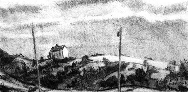
Here's some of the smaller pieces I showed the visitors. Above, are a pastel at left and at right the vine charcoal on which it was based. Below a vine charcoal and at bottom an oil on panel painted from it back in the studio.